
Contents
この講座で学ぶこと
WordPressは、既存テーマを使うだけでもサイトを作成できますが、本当に自由な表現や設計を行うためには、自分で「オリジナルテーマ」を作れることが最大の目標になります。この講座では、HTMLとCSSで作成したサンプルサイトをもとに、WordPressテーマへ変換する基本手順を学んでいきます。「なんとなくWordPressを使う」から、「仕組みを理解してWordPressを使う」へ。 その第一歩として、シンプルで最小構成のテーマを作成していきましょう。
この講座では、主に以下の内容を扱います。
- WordPressテーマの基本構造
- テーマフォルダーの作り方
index.phpとstyle.cssの役割- HTMLサイトをWordPressテーマに変換する方法
- テンプレートタグの基本
header.phpとfooter.phpへの分割- 投稿を表示する「ループ」の基本
- NEWS部分を管理画面から更新できるようにする方法
WordPress化するサンプルサイト
まずは、HTMLとCSSで以下のようなサンプルサイトを作成します。完成したHTMLサイトをもとに、WordPressテーマへ変換していきます。
▶︎ HTML版を見る

素材等は、サイトから直接DLできます。
▶︎ HTML+CSS一式DLする
「カテゴリー」と「投稿」
トップページにある「更新情報(NEWS)」は、WordPressの投稿機能を使って管理します。まずは、NEWSで使用するカテゴリーを作成しておきましょう。今回は、以下の3つのカテゴリーを作成します。
| カテゴリー名 | スラッグ |
|---|---|
| お知らせ | news |
| 制作実績 | works |
| 採用情報 | recruit |
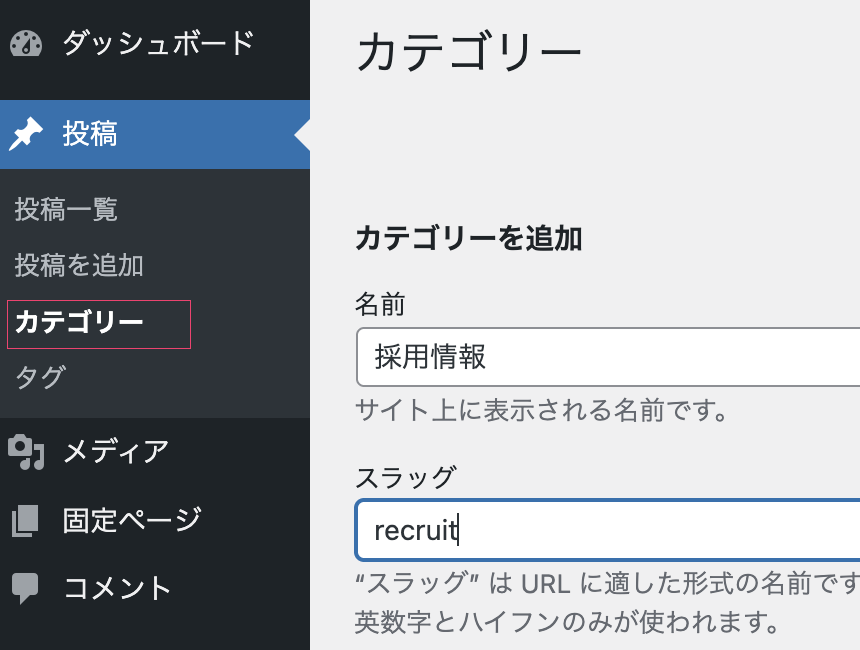
スラッグとは、URLの一部になる文字列です。そのため、基本的には半角英数字で入力しておきましょう。カテゴリーの「説明」欄は、各カテゴリーの説明文を入力する場所です。今回は空白のままで問題ありません。
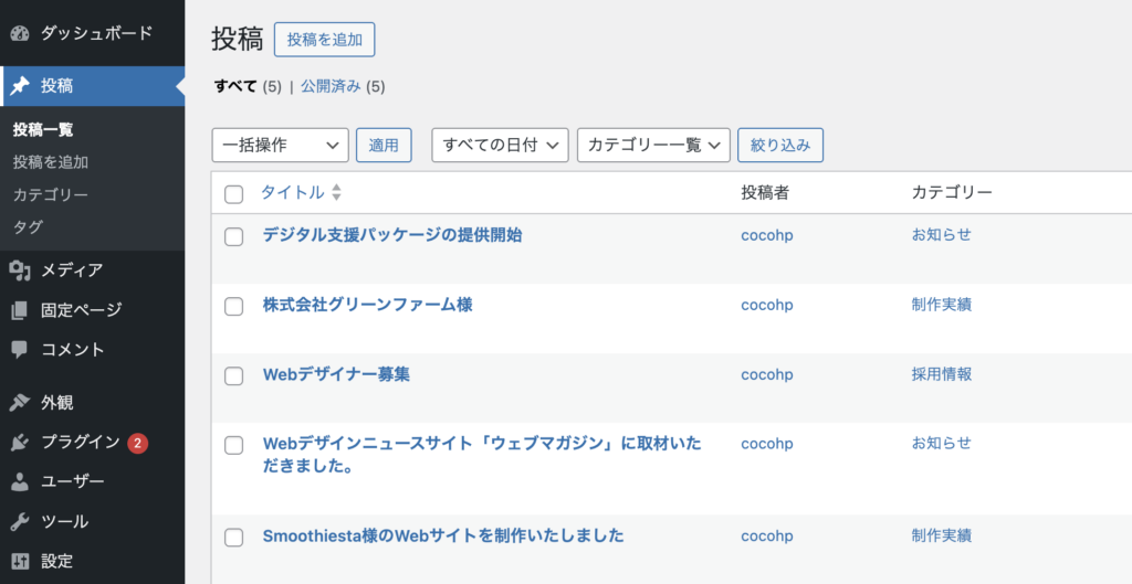
次に、記事を投稿していきましょう。トップページには最新3件だけを表示しますが、動作確認しやすいように、ダミー記事を5件ほど投稿しておくとよいでしょう。
ダミー投稿をDLする
こちらから、ダミー投稿をDLできます。▶︎ https://cocohp.pw/2026/les000/sample-posts.xml
上記xmlファイルを保存し、ツール ▶︎ インポートから投稿を増やしてください。
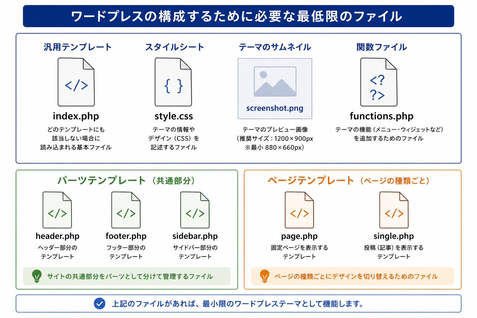
WordPressの最小構成テーマを作成する
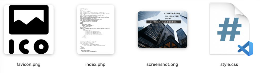
ここからは、WordPressテーマ作成の第一歩として、いちばんシンプルなテーマの形を作っていきます。WordPressのテーマというと複雑に見えますが、最初からたくさんのファイルを用意する必要はありません。まずは、テーマとして認識される最低限の形を作り、そこから少しずつ機能を広げていきます。WordPressのクラシックテーマでは、最小構成として以下のファイルが基本になります。
HTMLサイト → WordPressテーマに変換する
「サンプルカンパニー」を完成見本どおりにコーディングできたら、HTMLサイトをWordPressテーマへ変換していきます。
まず、index.htmlはバックアップを取ってから、拡張子を変更してindex.phpにします。
WordPressにおけるindex.phpは、トップページ専用のファイルではありません。どのページにも対応できる、汎用的なテンプレートです。
WordPressには、ページの種類ごとに専用テンプレートが存在します。たとえば、固定ページ用、投稿ページ用、カテゴリー一覧用などです。ただし、ページの種類に応じたテンプレートが存在しない場合は、最終的にindex.phpが使われます。つまり、index.phpは、すべてのページの「受け皿」になるファイルだと考えておきましょう。
次に、CSSフォルダー内に入っていたstyle.cssを、index.php と同じ階層に移動します。
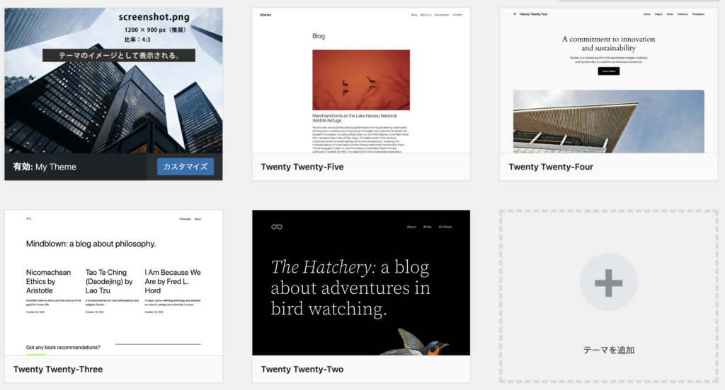
最後に、テーマのイメージとして使用する screenshot.pngも用意しておきます。screenshot.pngは、WordPress管理画面の「外観 > テーマ」に表示されるテーマ画像です。1200px × 900px で作成すると、概ねきれいに表示されます。
style.css にテーマ情報を記述する
WordPressテーマでは、style.css の先頭にテーマ情報を記述します。
このコメントがあることで、WordPressはそのフォルダーをテーマとして認識できるようになります。
/*
Theme Name: My Theme
Author:
Description: シンプルな企業サイト用テーマ
Version: 1.0
*/
このテーマ情報の下に、通常のCSSを続けて記述していきます。
テーマフォルダーを配置する
必要なファイルが揃ったら、テーマフォルダーをWordPress内に配置します。
テーマフォルダーは、以下の場所にアップロードします。→ wp-content/themes/
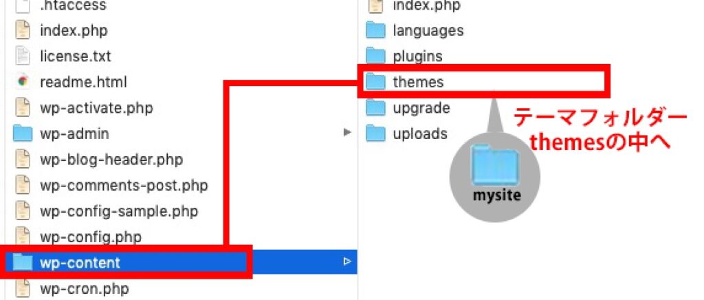
管理画面から、「外観 > テーマ」を開き、自分が作成したテーマが表示されていればOKです。
テンプレートタグに修正する
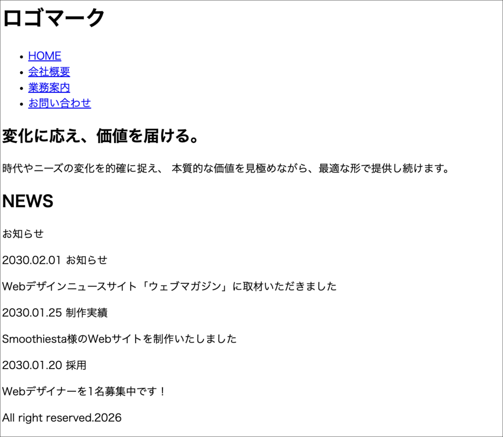
テーマを有効化してサイトにアクセスしてみましょう。
この段階では、テーマ自体は認識されていますが、CSSが正しく適用されていない場合があります。
また、画像も表示されない状態になっているはずです。
これは、HTMLで使っていた相対パスが、WordPressテーマ内ではそのまま使えないためです。
WordPress用のテンプレートタグを使って、パスを修正していきます。
CSSファイルのパスを修正する
■ 修正前は、以下のようにCSSを読み込んでいます。
<link rel="stylesheet" href="style.css">

■ WordPressテーマでは、以下のように修正します。
<link rel="stylesheet" href="<?php echo get_template_directory_uri(); ?>/style.css">
get_template_directory_uri() は、現在使用しているテーマフォルダーまでのURLを取得するためのWordPress関数です。
画像ファイルのパスを修正する
■ 修正前
<img src="images/main.jpg" alt="メインイメージ">

■ 修正後
<img src="<?php echo get_template_directory_uri(); ?>/images/main.jpg"  alt="alt="メインイメージ"">
画像やCSS、JavaScriptなど、テーマフォルダー内のファイルを読み込む箇所は、同じ考え方で修正していきます。
文字コード設定
HTMLの文字コードも、WordPress用の記述に変更します。bloginfo(‘charset’)は、WordPress側で設定されている文字コードを出力するテンプレートタグです。 通常はUTF-8 が出力されます。
<meta charset="<?php bloginfo('charset'); ?>">
bodyタグへの付加記述
body タグには、以下のように body_class() を追加します。body_class() は、WordPressがページの種類に応じたclass名を自動で出力してくれる機能です。
たとえば、トップページ、投稿ページ、固定ページ、カテゴリー一覧ページなど、それぞれのページに応じたclassが追加されます。
CSSでページごとの調整を行う際にも便利です。
<body <?php body_class(); ?>>index.phpを分割する
ここまでで、index.php の中には、HTML全体のコードが入っている状態です。
次は、共通部分であるヘッダーとフッターを分割していきます。WordPressでは、共通部分を別ファイルに分けて管理することができます。
- ヘッダー部分 →
header.php - フッター部分 →
footer.php - メイン部分 →
index.php
このように分けておくことで、複数ページを作成したときにも、共通部分を効率よく管理できます。
header.phpとして保存する
まず、index.php の上部にあるヘッダー部分を切り離します。<!DOCTYPE html> から、ヘッダーの終了タグ </header> 付近までをカットし、新しく header.php として保存します。head 内には、必ず wp_head() を記述します。
<?php wp_head(); ?>wp_head() は、WordPressが動作するうえで欠かせない、非常に重要な記述です。
テーマやプラグインが必要とするCSS、JavaScript、各種メタ情報などを自動的に出力するための仕組みです。
この記述がないと、デザインが崩れたり、プラグインが正常に動作しなかったりすることがあるので、head 内には必ず記述しておきましょう。
header.php
<!DOCTYPE html>
<html lang="ja">
<head>
<meta charset="<?php bloginfo('charset'); ?>">
<meta name="viewport" content="width=device-width, initial-scale=1.0">
<link rel="stylesheet" href="https://unpkg.com/destyle.css@3.0.2/destyle.min.css">

<link rel="stylesheet" href="<?php echo get_template_directory_uri(); ?>/style.css">
<link rel="stylesheet" href="https://cdn.jsdelivr.net/npm/swiper@12/swiper-bundle.min.css">
<?php wp_head(); ?>
</head>

<body <?php body_class(); ?>>
<div class="wrap">
<header class="header">
<h1 class="logo">
<a href="<?php echo home_url(); ?>">
<img src="<?php echo get_template_directory_uri();?>/images/logo.svg" alt="SAMPLE COMPANY"></a></h1>
<nav>
      <nav>
       <ul class="nav">
          <li><a href="#">HOME</a></li>
          <li><a href="#">会社概要</a></li>
          <li><a href="#">業務案内</a></li>
          <li><a href="#">お問い合わせ</a></li>
        </ul>
      </nav>
</header>
</div>
上記の部分を、index.phpから「カット」し、新たにheader.phpとして保存します。
footer.phpにも、<?php wp_footer(); ?>を記述しておきましょう。wp_footer()は、WordPressやプラグインが必要とするJavaScriptなどを出力するための重要な記述です。 通常は、</body>の直前に記述します。
<footer class="footer">
<div class="wrap">
<small>Copyright © 2026 SAMPLE. All rights reserved.</small>
</footer>
<script src="https://cdn.jsdelivr.net/npm/swiper@12/swiper-bundle.min.js"></script>
<script src="<?php echo get_template_directory_uri(); ?>/js/script.js"></script>
<?php wp_footer(); ?>
</body>
</html>
上記の部分を、index.phpから「カット」し、新たにfooter.phpとして保存します。
切り離した header.php と footer.php は、index.php から読み込みます。
<?php get_header(); ?>

<section class="hero js-fade-up">
<img src="<?php echo get_template_directory_uri(); ?>/images/main.jpg" />
<div class="hero__catch">
<p class="hero__text">Hello!World
<span class="hero__wp">by wordpress</span>
</p>
</div>
</section>

<div class="wrap">
<section class="top-message">
<h2 class="title">変化に応え、価値を届ける。</h2>
<p>
時代やニーズの変化を的確に捉え、
本質的な価値を見極めながら、最適な形で提供し続けます。</p>
</section>


	  <!--- NEWS---------------------->
  <section class="news-section">
      <div class="news-heading">
        <h2 class="news-heading__title">NEWS</h2>
        <p class="news-heading__sub">お知らせ</p>
      </div>
<div class="news-list">
      <ul>
        <li class="news-item">
          <time class="news-date" datetime="2030-02-01">2030.02.01</time>
          <span class="news-tag">お知らせ</span>
          <p class="news-text"><a href="#">デジタル支援パッケージの提供開始</a></p>
        </li>

        <li class="news-item">
          <time class="news-date" datetime="2030-01-25">2030.01.25</time>
          <span class="news-tag">制作実績</span>
          <p class="news-text"><a href="#">株式会社グリーンファーム様</a></p>
        </li>

        <li class="news-item">
          <time class="news-date" datetime="2030-01-20">2030.01.20</time>
          <span class="news-tag">採用</span>
          <p class="news-text"><a href="#">Webデザイナーを1名募集中です!</a></p>
        </li>
      </ul>
    </div>
    </section>


<!--- card!---------------------->
<section class="cards">
  <a href="#" class="card card--link">
    <img src="<?php echo get_template_directory_uri(); ?>/images/president.jpg" alt="メッセージ">
<span class="card__title">メッセージ</span>
  </a>

  <a href="#" class="card card--link">
    <img src="<?php echo get_template_directory_uri(); ?>/images/concept.jpg" alt="コンセプト">
    <span class="card__title">コンセプト</span>
  </a>

  <a href="#" class="card card--link">
    <img src="<?php echo get_template_directory_uri(); ?>/images/office.jpg" alt="お問い合わせ">
<span class="card__title">お問い合わせ</span>
  </a>
</section>
</div><!------wrapここまで ---------->

<!------ slider------>

<section class="works-slider">
  <div class="swiper works-swiper">
    <div class="swiper-wrapper">
      <div class="swiper-slide"><img src="<?php echo get_template_directory_uri(); ?>/images/image01.jpg" alt=""></div>
      <div class="swiper-slide"><img src="<?php echo get_template_directory_uri(); ?>/images/image02.jpg" alt=""></div>
      <div class="swiper-slide"><img src="<?php echo get_template_directory_uri(); ?>/images/image03.jpg" alt=""></div>
      <div class="swiper-slide"><img src="<?php echo get_template_directory_uri(); ?>/images/image04.jpg" alt=""></div>
      <div class="swiper-slide"><img src="<?php echo get_template_directory_uri(); ?>/images/image05.jpg" alt=""></div>
      <div class="swiper-slide"><img src="<?php echo get_template_directory_uri(); ?>/images/image06.jpg" alt=""></div>
      <div class="swiper-slide"><img src="<?php echo get_template_directory_uri(); ?>/images/image07.jpg" alt=""></div>
      <div class="swiper-slide"><img src="<?php echo get_template_directory_uri(); ?>/images/image08.jpg" alt=""></div>
      <div class="swiper-slide"><img src="<?php echo get_template_directory_uri(); ?>/images/image09.jpg" alt=""></div>
      <div class="swiper-slide"><img src="<?php echo get_template_directory_uri(); ?>/images/image10.jpg" alt=""></div>
    </div>
  </div>
</section>


<?php get_footer(); ?>
これで、index.phpにはメインコンテンツ部分だけを残すことができます。
ループを設定する
次に、NEWS部分をWordPressの投稿機能と連動させます。現在のNEWS部分は、HTMLに直接書かれた固定の内容です。これを、WordPressの管理画面から投稿した内容が自動で表示されるように変更していきます。このときに使うのが、「ループ(The Loop)」と呼ばれる仕組みです。ループとは、WordPressに保存されている投稿データを1件ずつ取り出し、繰り返し表示するための基本構造です。たとえば、以下のような場所で使われます。
- 新着記事一覧
- お知らせ一覧
- ブログ一覧
- 制作実績一覧
ループの基本的な流れは、以下のとおりです。
- 投稿があるか確認する
- 投稿を1件ずつ取り出す
- タイトルや日付などを表示する
- すべての投稿が表示されるまで繰り返す
この仕組みを理解すると、ニュース一覧だけでなく、ブログ記事や制作実績など、さまざまなコンテンツを動的に表示できるようになります。
最小構成ループ
まずは、WordPressの基本的なループを見てみましょう。
<?php if (have_posts()) : ?>
  <?php while (have_posts()) : the_post(); ?>

    <h2><?php the_title(); ?></h2>
    <p><?php the_time('Y.m.d'); ?></p>
    <p><?php the_content(); ?></p>

  <?php endwhile; ?>
<?php endif; ?>
ループ解説:
| 記述 | 意味 |
|---|---|
have_posts() | 投稿があるかどうかを確認する |
the_post() | 投稿を1件取り出す |
the_title() | 投稿タイトルを表示する |
the_time() | 投稿日を表示する |
the_content() | 投稿本文を表示する |
実際のNEWS部分にループを設定する
今回は、トップページのNEWS部分に、最新の投稿3件を表示します。表示する内容は、以下の3つです。また、投稿タイトルには、記事ページへのリンクを設定します。
- 投稿日
- カテゴリー
- 投稿タイトル
以下のコードを、NEWS部分の .news-list に入れます。(該当するクラスセレクタを、ループタグへはめ込みます。)
<div class="news-list">
  <?php
  $args = [
    'post_type' => 'post',
    'posts_per_page' => 3
  ];
  $query = new WP_Query($args);
  ?>

  <?php if ( $query->have_posts() ) : ?>
    <ul>
      <?php while ( $query->have_posts() ) : $query->the_post(); ?>
        <li class="news-item">
          <time class="news-date" datetime="<?php echo get_the_date('Y-m-d'); ?>">
            <?php echo get_the_date('Y.m.d'); ?>
          </time>

          <span class="news-tag">
     <?php
    // カテゴリーを表示
    $categories = get_the_category();
    if ( ! empty( $categories ) ) {
        echo '<div class="post-categories">';
        foreach ( $categories as $category ) {
            echo '<a href="' . esc_url( get_category_link( $category->term_id ) ) . '">' . esc_html( $category->name ) . '</a> ';
        }
        echo '</div>';
    }
    ?>
          </span>

          <p class="news-text">
            <a href="<?php the_permalink(); ?>">
              <?php the_title(); ?>
            </a>
          </p>
        </li>
      <?php endwhile; ?>
    </ul>
    <?php wp_reset_postdata(); ?>
  <?php endif; ?>
</div>
今回は、カテゴリー名を1つだけ表示するシンプルな形にしています。
複数のカテゴリーを表示する方法もありますが、まずは見た目と構造を理解しやすいように、最初のカテゴリーだけを表示しています。
NEWS部分を差し替えたindex.php
NEWS部分をループに差し替えると、index.php は以下のようになります。
<?php get_header(); ?>

<section class="hero js-fade-up">
<img src="<?php echo get_template_directory_uri(); ?>/images/main.jpg" />
 <div class="hero__catch">
    <p class="hero__text">Hello!World
        <span class="hero__wp">by wordpress</span>
</p>
  </div>
</section>

  <div class="wrap">
    <section class="top-message">
      <h2 class="title">変化に応え、価値を届ける。</h2>
      <p>
        時代やニーズの変化を的確に捉え、
        本質的な価値を見極めながら、最適な形で提供し続けます。</p>
	  </section>
	  <!--- NEWS---------------------->
    <section class="news-section">
      <div class="news-heading">
        <h2 class="news-heading__title">NEWS</h2>
        <p class="news-heading__sub">お知らせ</p>
      </div>

<div class="news-list">
  <?php
  $args = [
    'post_type' => 'post',
    'posts_per_page' => 3
  ];
  $query = new WP_Query($args);
  ?>

  <?php if ( $query->have_posts() ) : ?>
    <ul>
      <?php while ( $query->have_posts() ) : $query->the_post(); ?>
        <li class="news-item">
          <time class="news-date" datetime="<?php echo get_the_date('Y-m-d'); ?>">
            <?php echo get_the_date('Y.m.d'); ?>
          </time>

          <span class="news-tag">
     <?php
    // カテゴリーを表示
    $categories = get_the_category();
    if ( ! empty( $categories ) ) {
        echo '<div class="post-categories">';
        foreach ( $categories as $category ) {
            echo '<a href="' . esc_url( get_category_link( $category->term_id ) ) . '">' . esc_html( $category->name ) . '</a> ';
        }
        echo '</div>';
    }
    ?>
          </span>

          <p class="news-text">
            <a href="<?php the_permalink(); ?>">
              <?php the_title(); ?>
            </a>
          </p>
        </li>
      <?php endwhile; ?>
    </ul>
    <?php wp_reset_postdata(); ?>
  <?php endif; ?>
</div>
    </section>

<section class="cards">
  <a href="#" class="card card--link">
    <img src="<?php echo get_template_directory_uri(); ?>/images/president.jpg" alt="メッセージ">
<span class="card__title">メッセージ</span>
  </a>

  <a href="#" class="card card--link">
    <img src="<?php echo get_template_directory_uri(); ?>/images/concept.jpg" alt="コンセプト">
    <span class="card__title">コンセプト</span>
  </a>

  <a href="#" class="card card--link">
    <img src="<?php echo get_template_directory_uri(); ?>/images/office.jpg" alt="お問い合わせ">
<span class="card__title">お問い合わせ</span>
  </a>
</section>
</div><!------wrapここまで ---------->

<!------ slider------>

<section class="works-slider">
  <div class="swiper works-swiper">
    <div class="swiper-wrapper">
      <div class="swiper-slide"><img src="<?php echo get_template_directory_uri(); ?>/images/image01.jpg" alt=""></div>
      <div class="swiper-slide"><img src="<?php echo get_template_directory_uri(); ?>/images/image02.jpg" alt=""></div>
      <div class="swiper-slide"><img src="<?php echo get_template_directory_uri(); ?>/images/image03.jpg" alt=""></div>
      <div class="swiper-slide"><img src="<?php echo get_template_directory_uri(); ?>/images/image04.jpg" alt=""></div>
      <div class="swiper-slide"><img src="<?php echo get_template_directory_uri(); ?>/images/image05.jpg" alt=""></div>
      <div class="swiper-slide"><img src="<?php echo get_template_directory_uri(); ?>/images/image06.jpg" alt=""></div>
      <div class="swiper-slide"><img src="<?php echo get_template_directory_uri(); ?>/images/image07.jpg" alt=""></div>
      <div class="swiper-slide"><img src="<?php echo get_template_directory_uri(); ?>/images/image08.jpg" alt=""></div>
      <div class="swiper-slide"><img src="<?php echo get_template_directory_uri(); ?>/images/image09.jpg" alt=""></div>
      <div class="swiper-slide"><img src="<?php echo get_template_directory_uri(); ?>/images/image10.jpg" alt=""></div>
    </div>
  </div>
</section>


<?php get_footer(); ?>
最新の3件が表示される
ここまで設定できたら、管理画面から投稿した最新3件が、トップページのNEWS部分に表示されます。
以下の内容が正しく表示されていれば完成です。
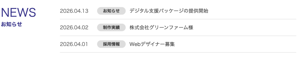
- 投稿日
- カテゴリー名
- 投稿タイトル
- 投稿タイトルから記事ページへのリンク
これで、HTMLに直接書き込んでいたNEWS部分を、WordPressの投稿機能で管理できるようになりました。
次回は、個別投稿ページ、固定ページ、カテゴリー一覧ページなど、ページの種類ごとにテンプレートを分けていく方法を学んでいきます。